“It concerns appearance.”
It concerns what is felt. The Impressionist paints what the eye receives; the Expressionist paints what rises from within the person. So this house began with a mood, and only then chose a color.
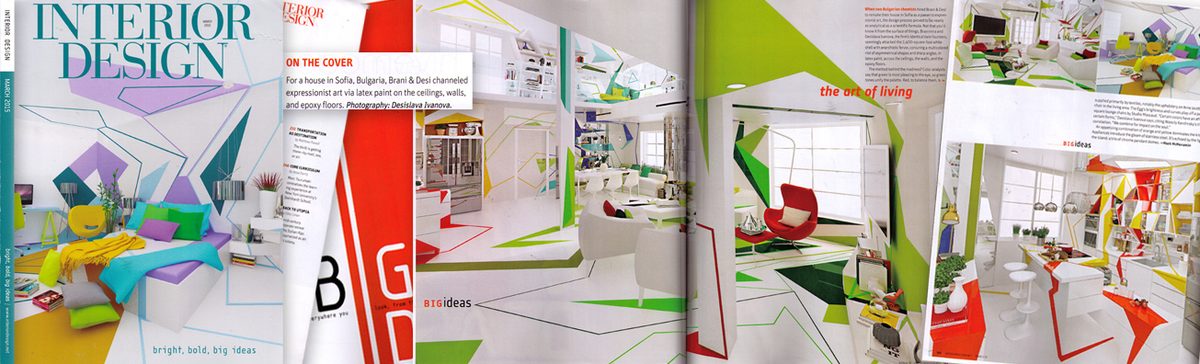
Cover of Interior Design Magazine, March 2015
A house in which color is not applied to the walls but required of them.
Can a person live inside a painting?
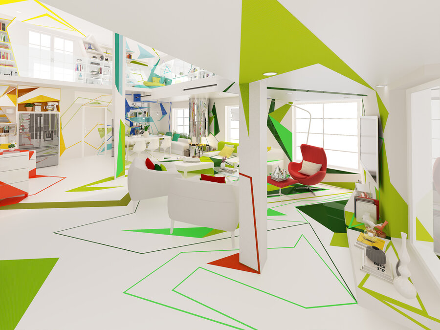
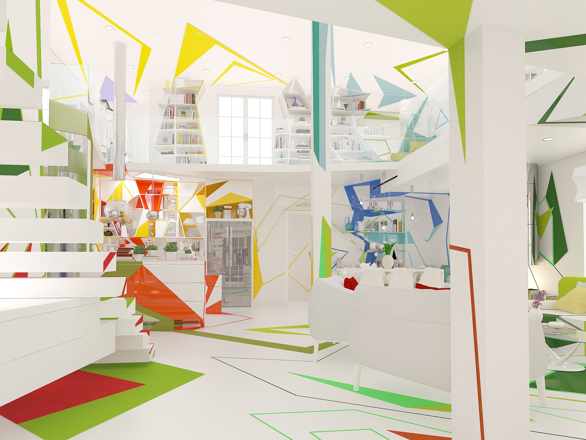
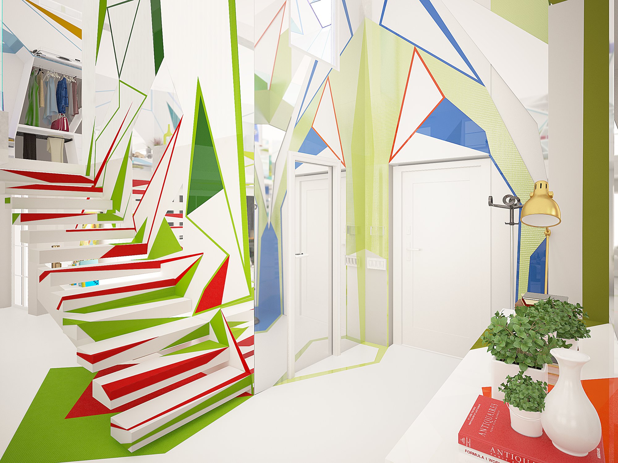
The owners were not given rooms. They were given a world of art to enter. The title belongs to Expressionism, where form and color are not description but pressure: they make a mood, they force an idea, they move a person from warmth to confidence, from comfort to the will to make. Sharp, acute forms carry the warmth. White is the held breath between one shape and the next. To live here is to feel before one understands.
Munich, around 1910. Dusk.
Wassily Kandinsky comes back to his studio as the light goes. Against the wall a canvas burns, all color and form, with nothing in it he can name. It is the most beautiful picture he has seen in days. He steps closer. It is his own painting, lying on its side.
He wrote later that in that moment he understood how the recognizable object can stand between a person and a picture. Color and form were already enough.
What if a room could do the same?The question behind this house
This house repeats the experiment. It turns the room onto its side and lives in what remains: shape, color, and the white between them.
Before a painting by Monet he feels its force long before he can say what it shows. Soon he leaves the law to paint.
Color and form are named as powers that act on the soul directly.
Which color belongs to which form? The yellow triangle, the red square, the blue circle.
The canvas becomes a field of tension, where the acute angle burns warm.
In Sofia those ideas become wall, floor and light, and then a magazine cover.
Every form has a reason that is felt before it is explained. Nothing here is ornament.
Colors resound as instruments do. A room is tuned the way an orchestra is tuned.
Certain colors belong to certain forms. The sharp form carries warmth, the soft form carries calm.
The Bauhaus pairing of yellow with the triangle, red with the square and blue with the circle is the quiet law beneath the shapes on these walls and floors.
“It concerns appearance.”
It concerns what is felt. The Impressionist paints what the eye receives; the Expressionist paints what rises from within the person. So this house began with a mood, and only then chose a color.
“It belongs in the gallery, not in the home.”
Kandinsky wanted the reverse. If color and form act on the soul, the place to meet them is the room where a life is spent. The Bauhaus, where he taught from 1922, was founded on carrying art into daily life.
“He was always an artist.”
He trained in law and economics and taught at the University of Moscow in his late twenties. At thirty he gave it up for painting. The late start did not loosen his rules. It sent him looking for them with more urgency.
 Cover · Interior Design Magazine, USA · March 2015
A house is lived through a day, and the day changes its color as it passes. Move the marker.
For Kandinsky certain colors have an affinity with certain forms, and together they work upon the human soul. Enter, one room at a time.
The short poems in each room come from our books The Home Missed Itself: four slim volumes of 33 interior haiku each.
“All the plates are red,”
said the cupboard
to the white plate.The Home Missed Itself, Book 1
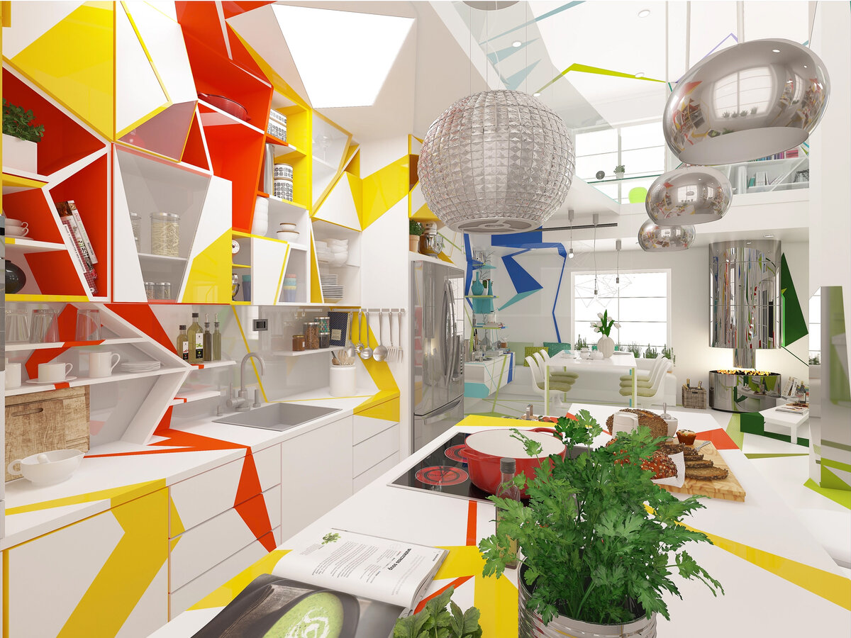
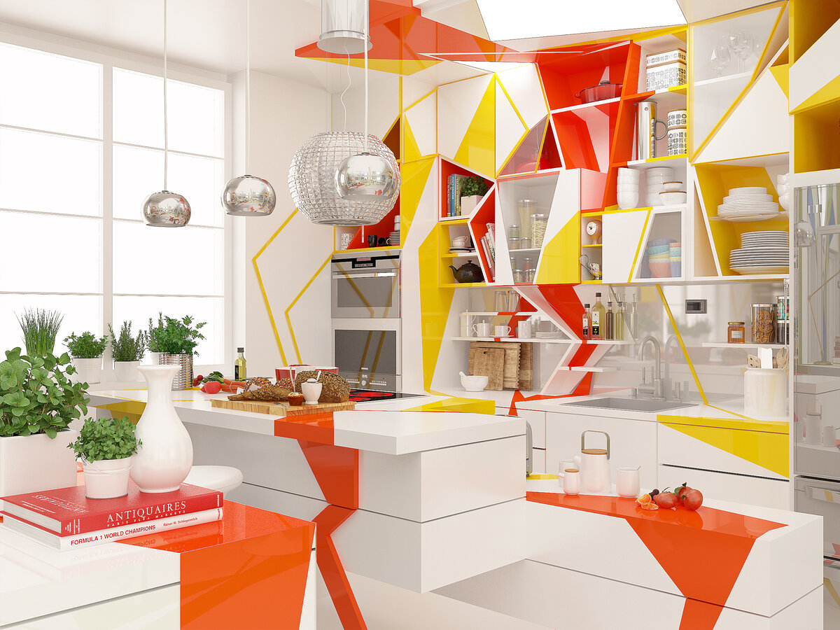
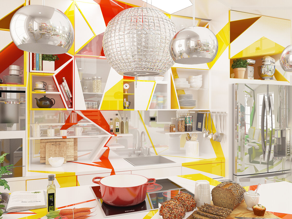
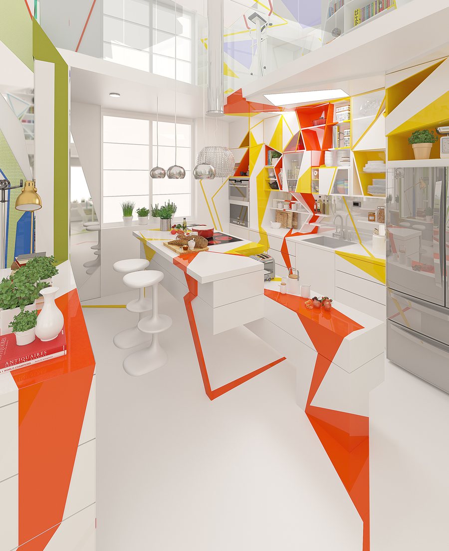
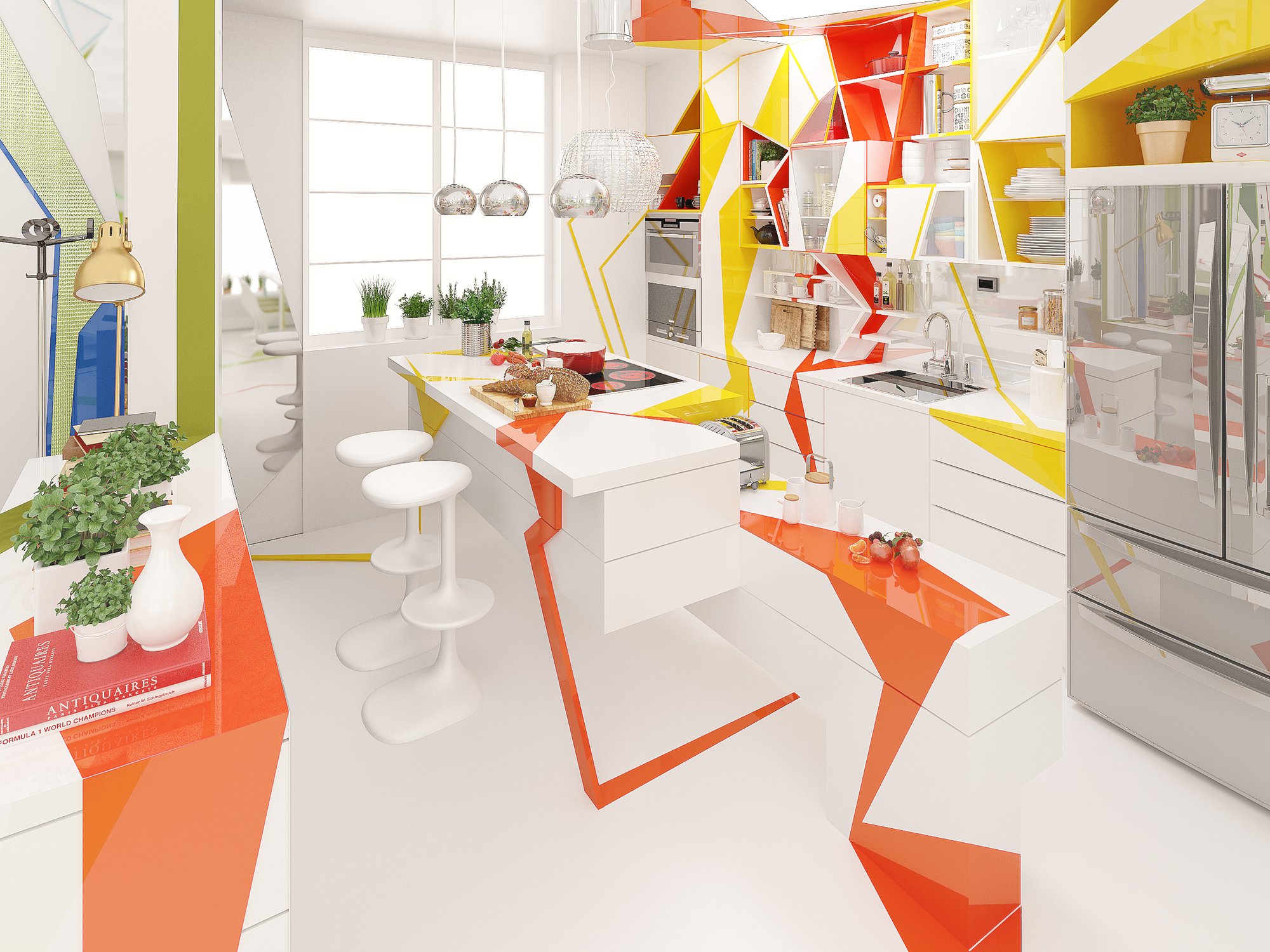
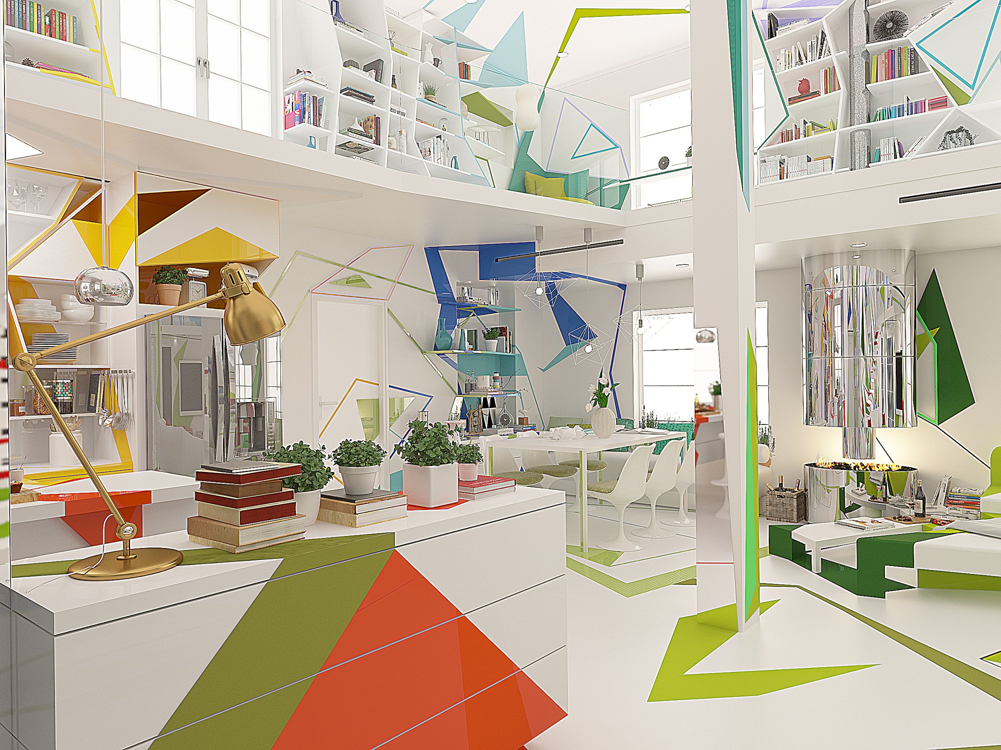
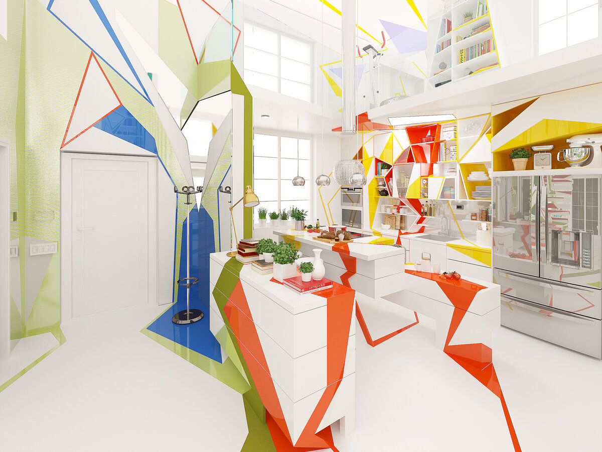
The warmest room in the house. Red and orange carry its energy: the red sharp and loud, the orange rounder, more given to company. The yellow niches press forward like a call. White is the pause that lets the strong colors breathe.
The table invites
all four-legged chairs.
The sofa relaxes.The Home Missed Itself, Book 4
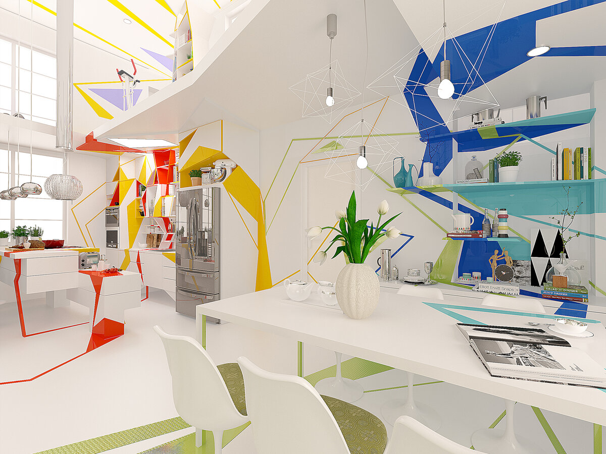
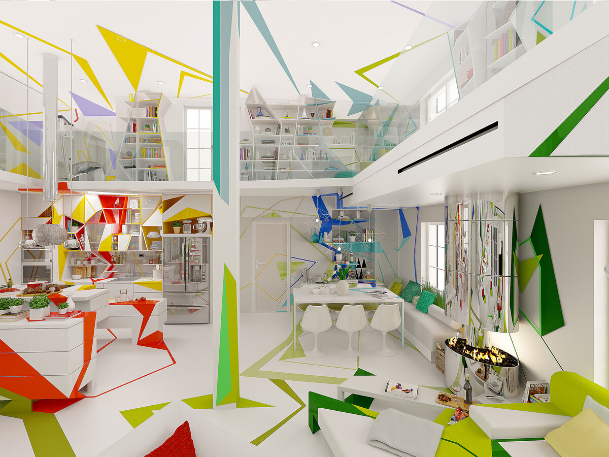
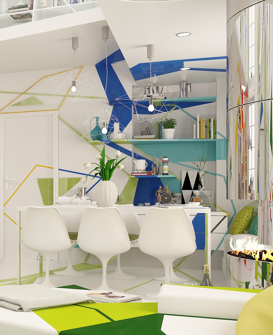
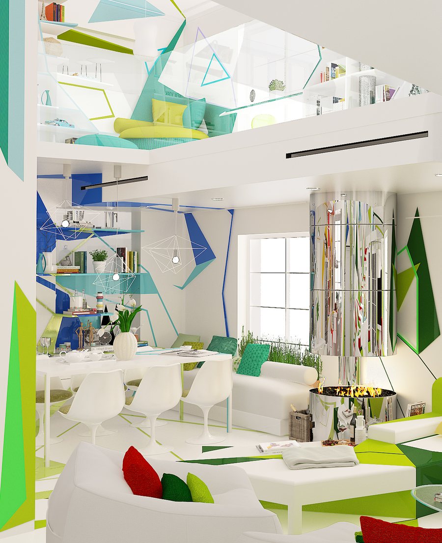
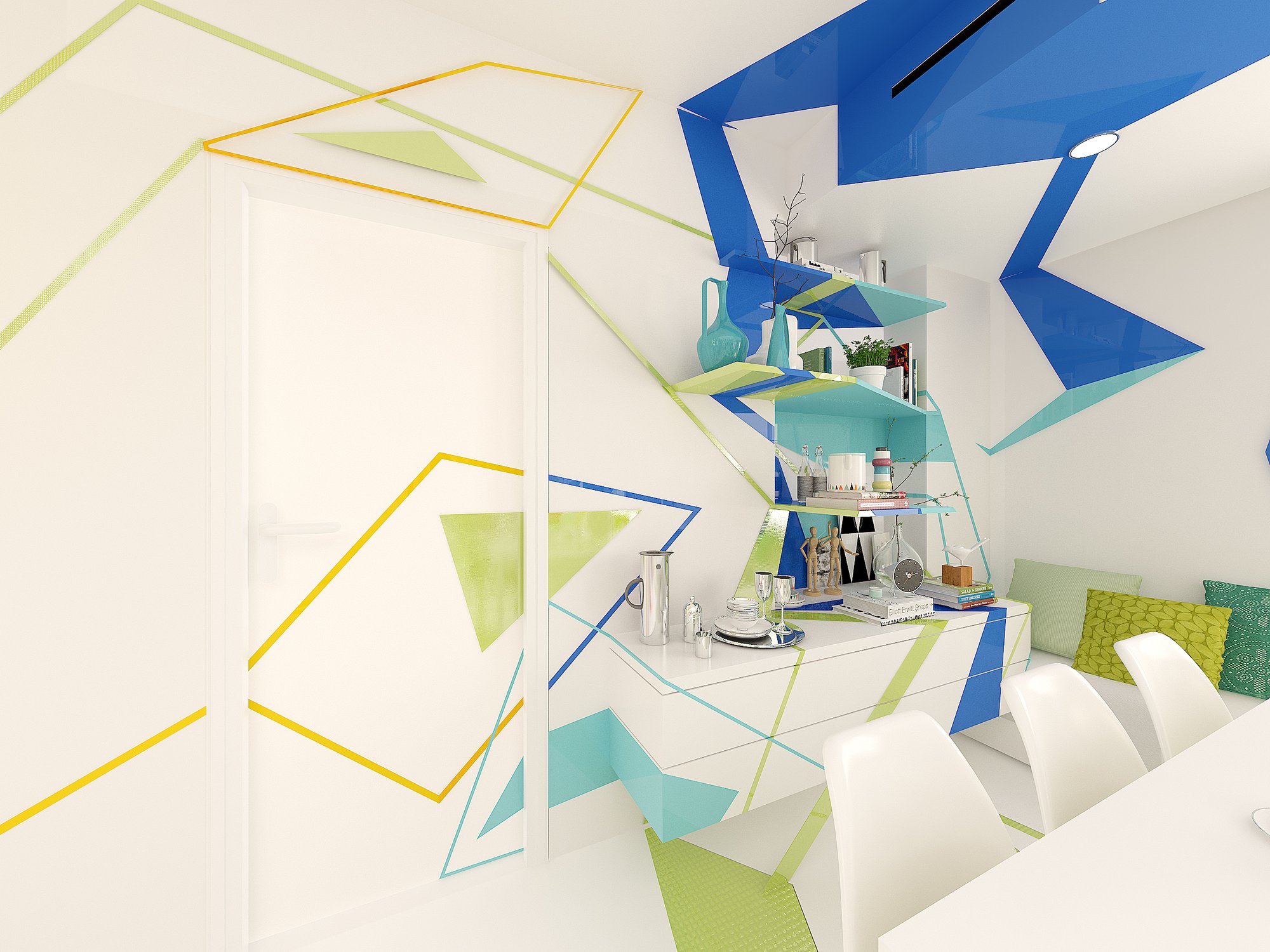
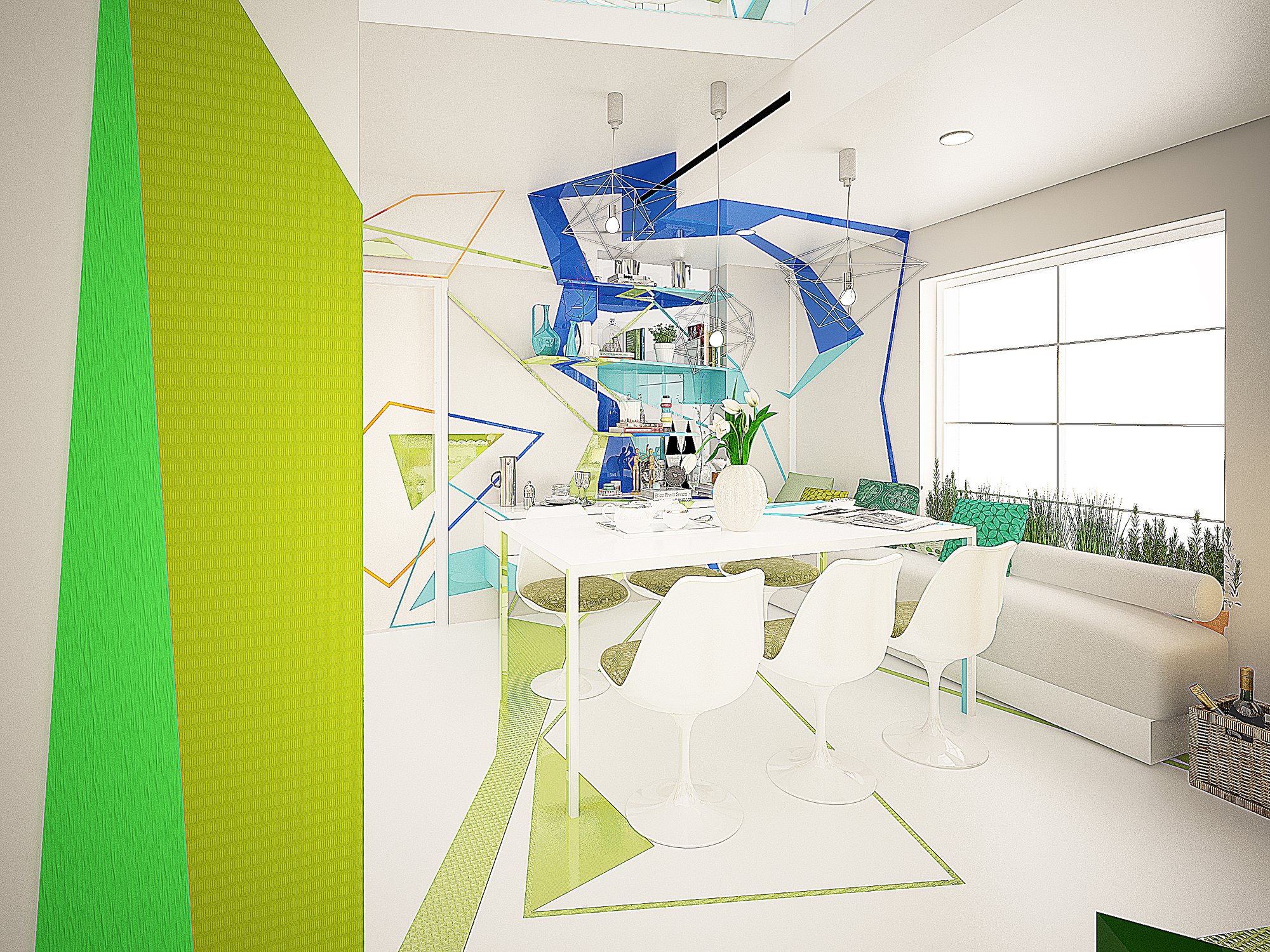
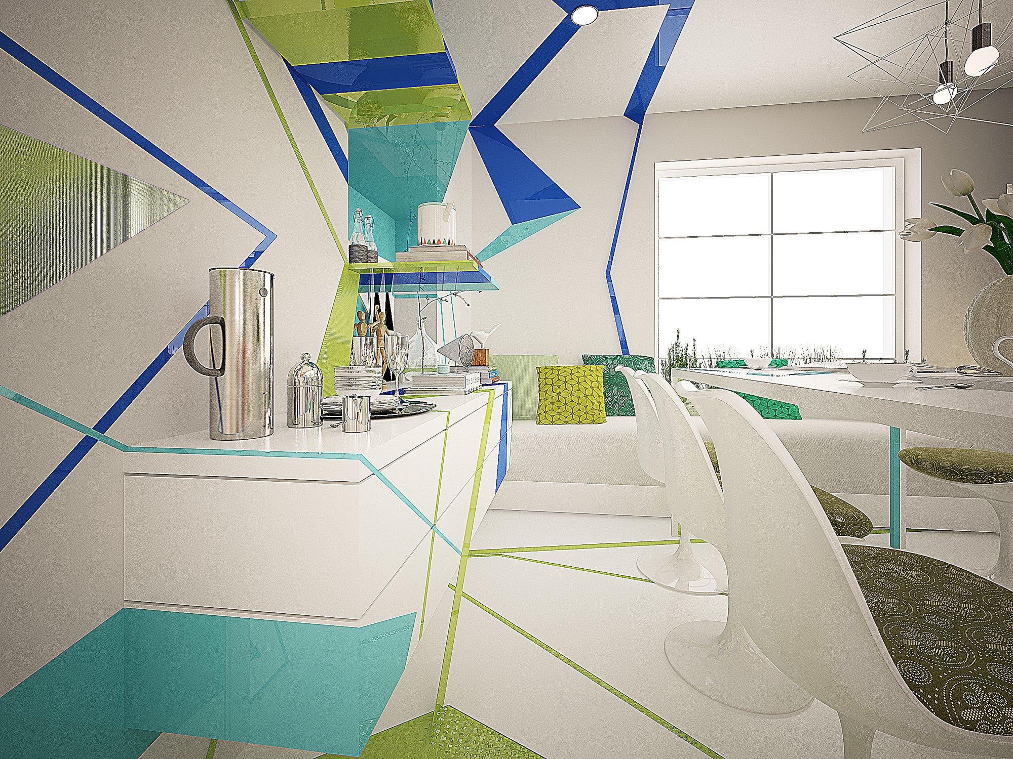
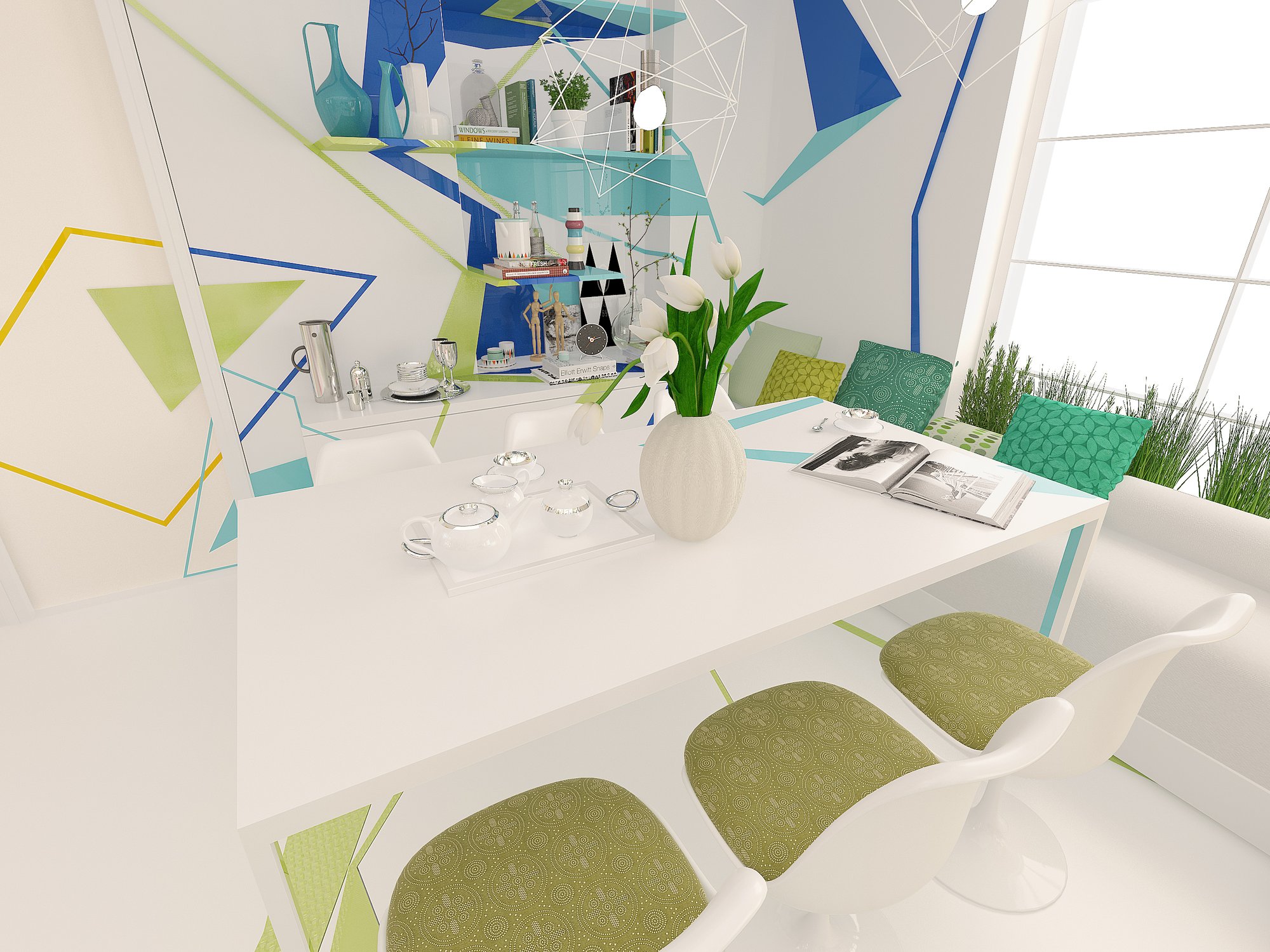
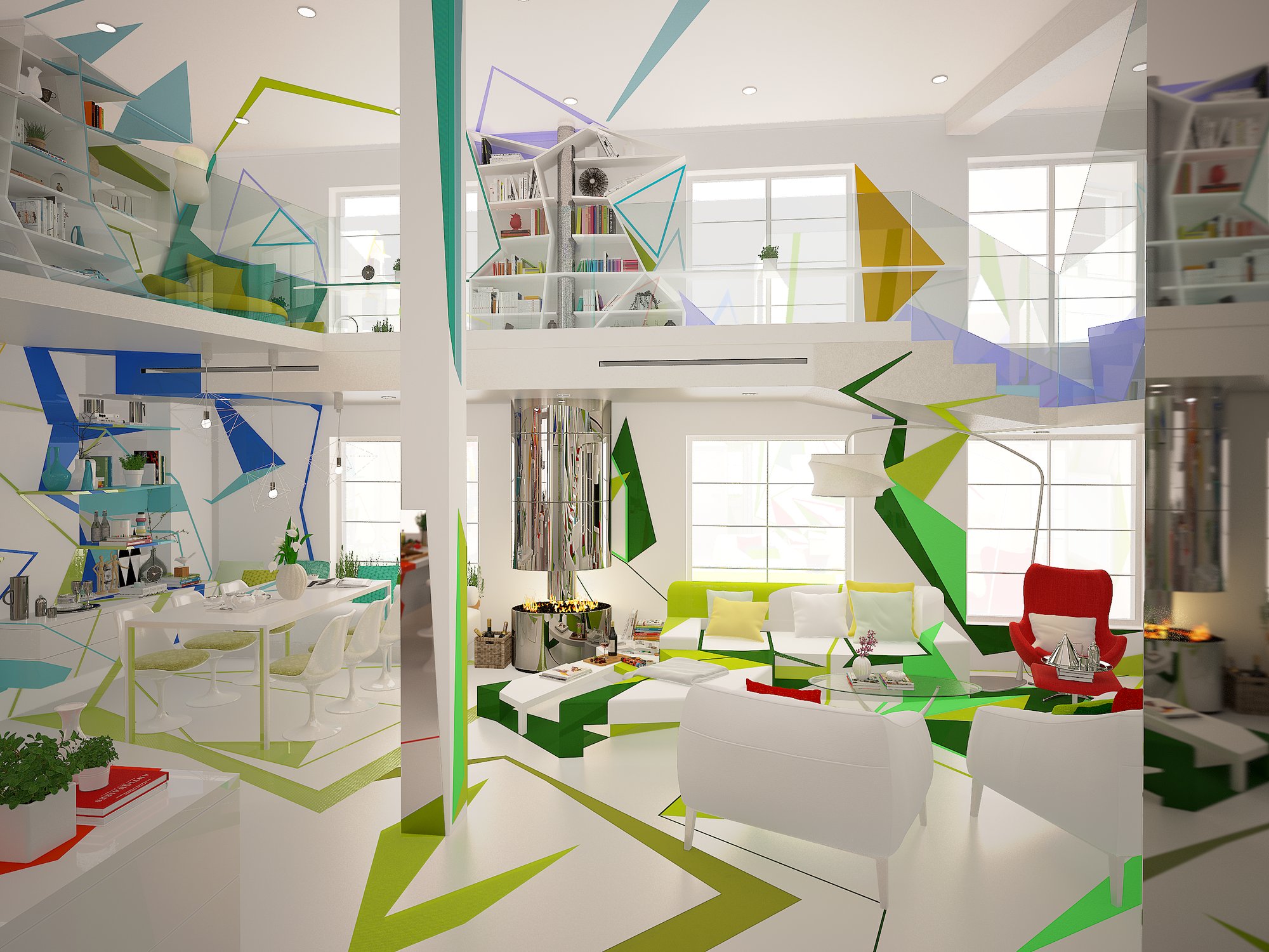
A table for seven or eight. Blue and green bring calm and release to the meal. The acute edges of the colored shapes warm the cool hues, so the room welcomes and does not withdraw.
The sofa breathed
the butterflies on the curtain —
and the cushions flew
toward the flowers.The Home Missed Itself, Book 1
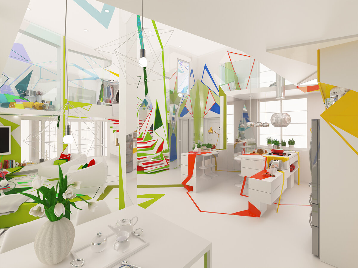
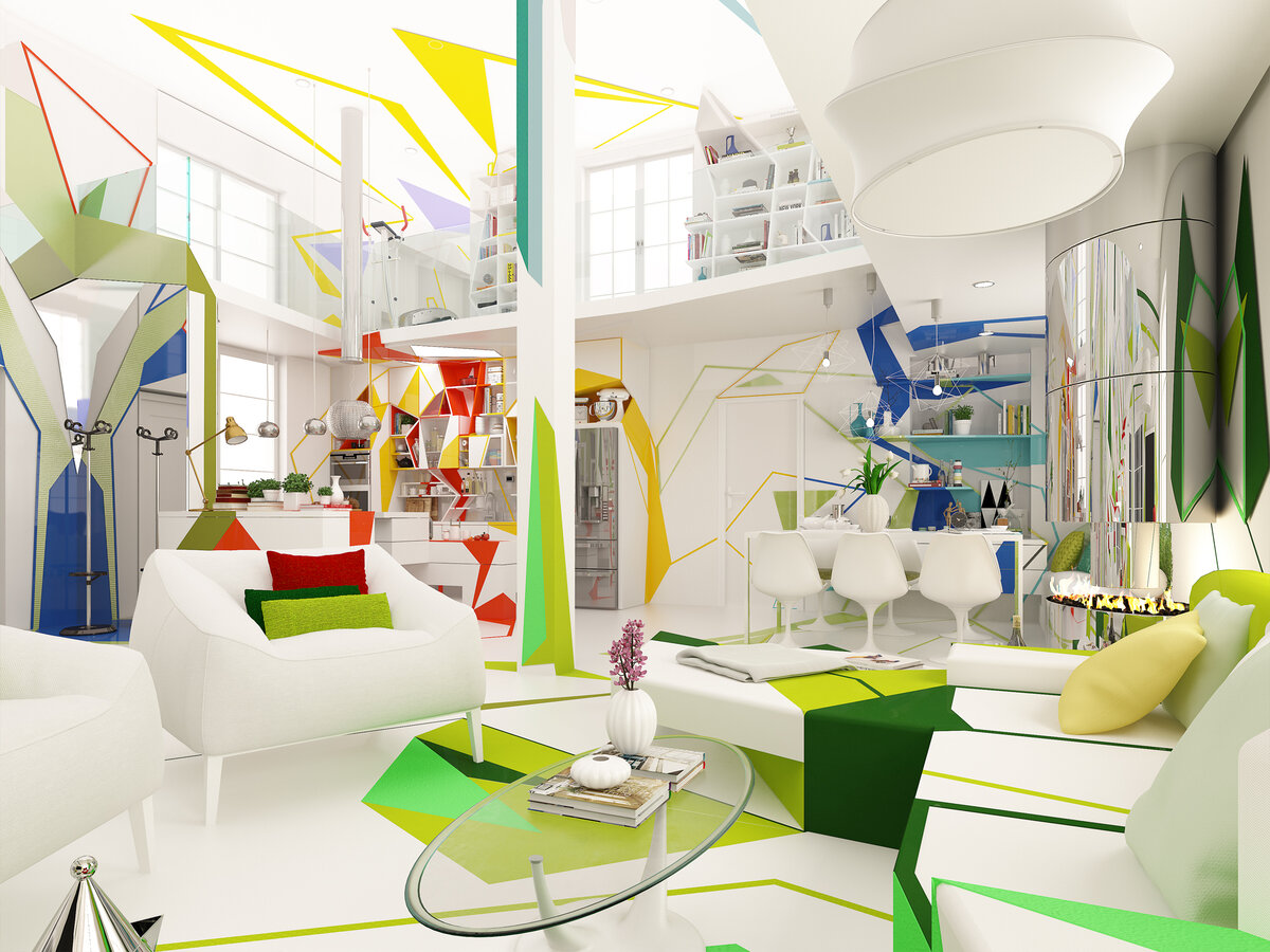
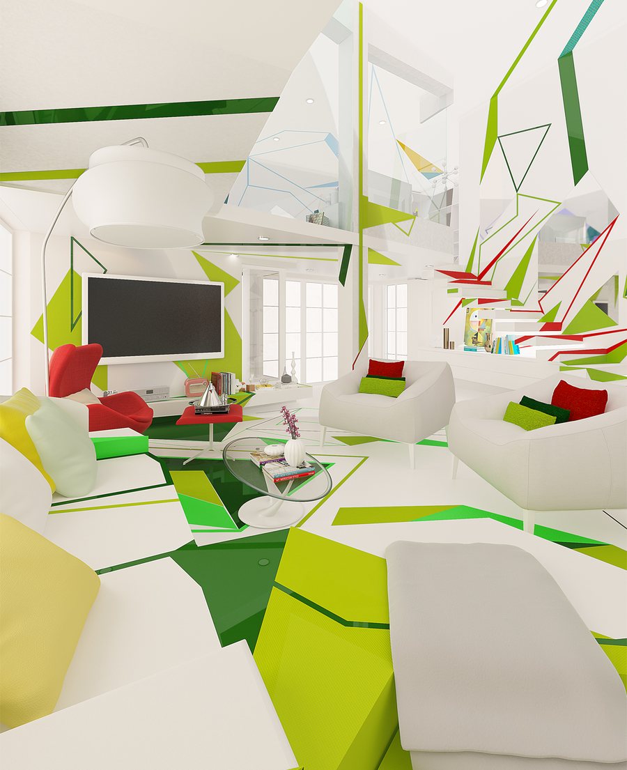
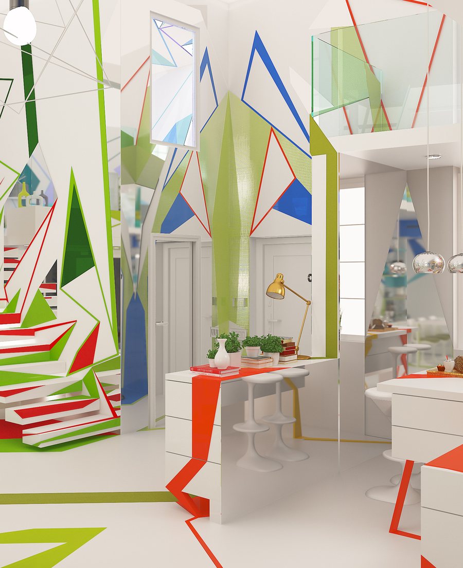
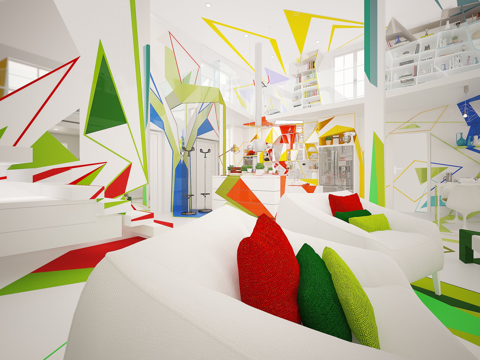
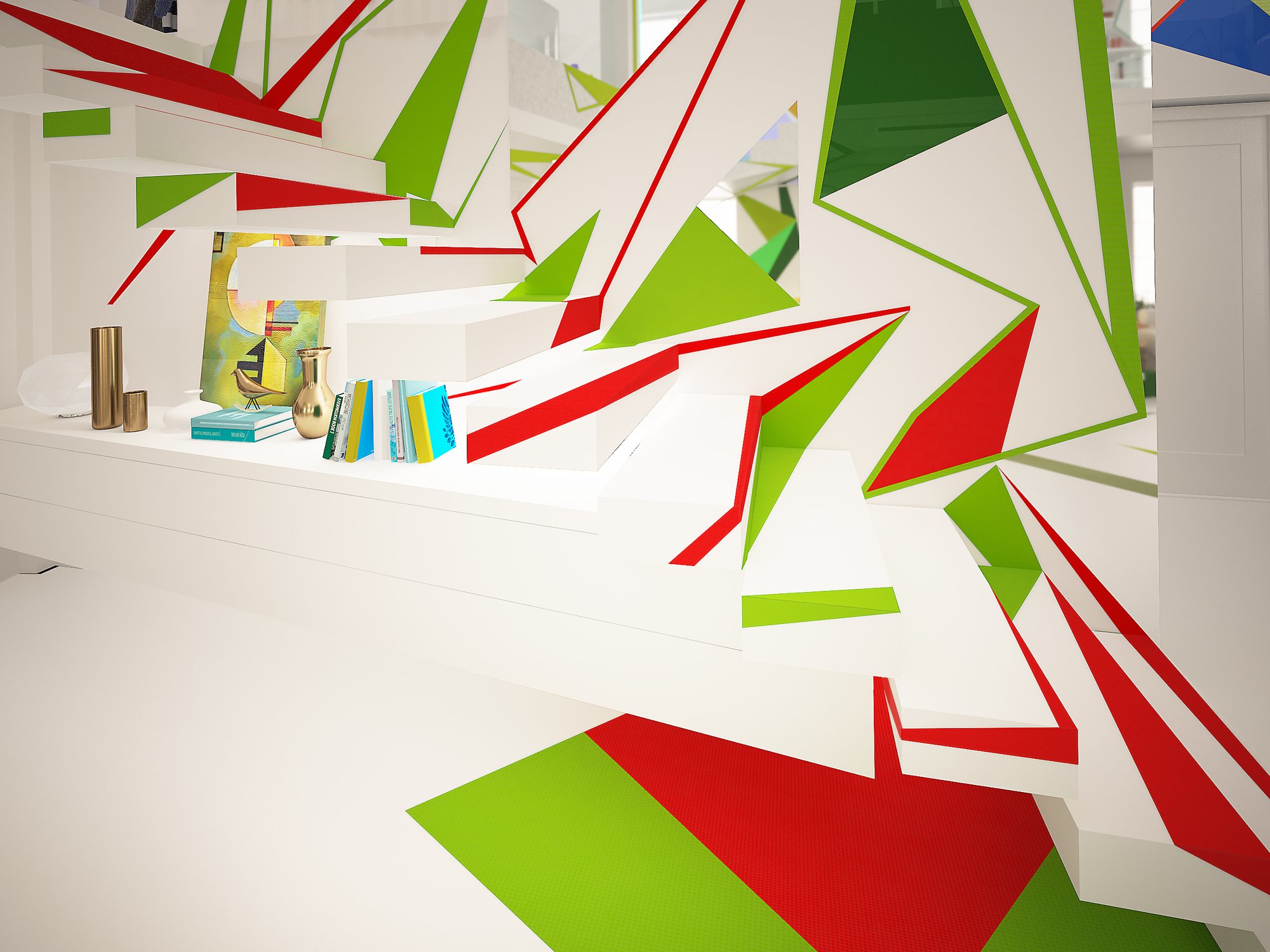
The room for rest and for talk. Green, the color the eye accepts most gladly, appears in many shades. Red, its complement, stands in the furniture, the cushions and a few shapes by the stairs, and keeps it from sleep.
The yellow cushion yellowed,
the contemplating sofa mistook it
for the moon.The Home Missed Itself, Book 2
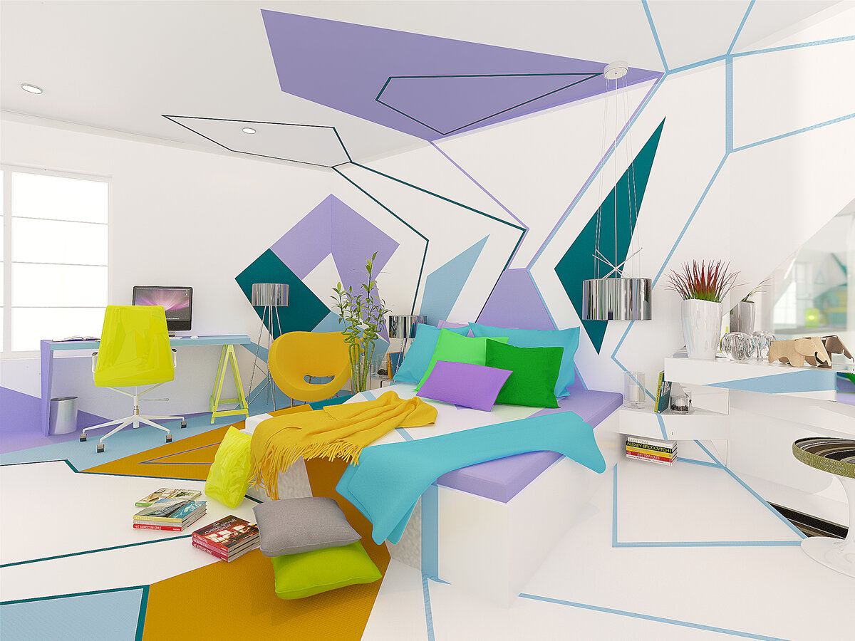
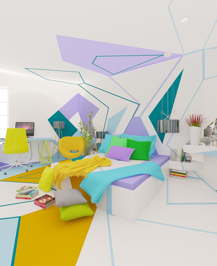
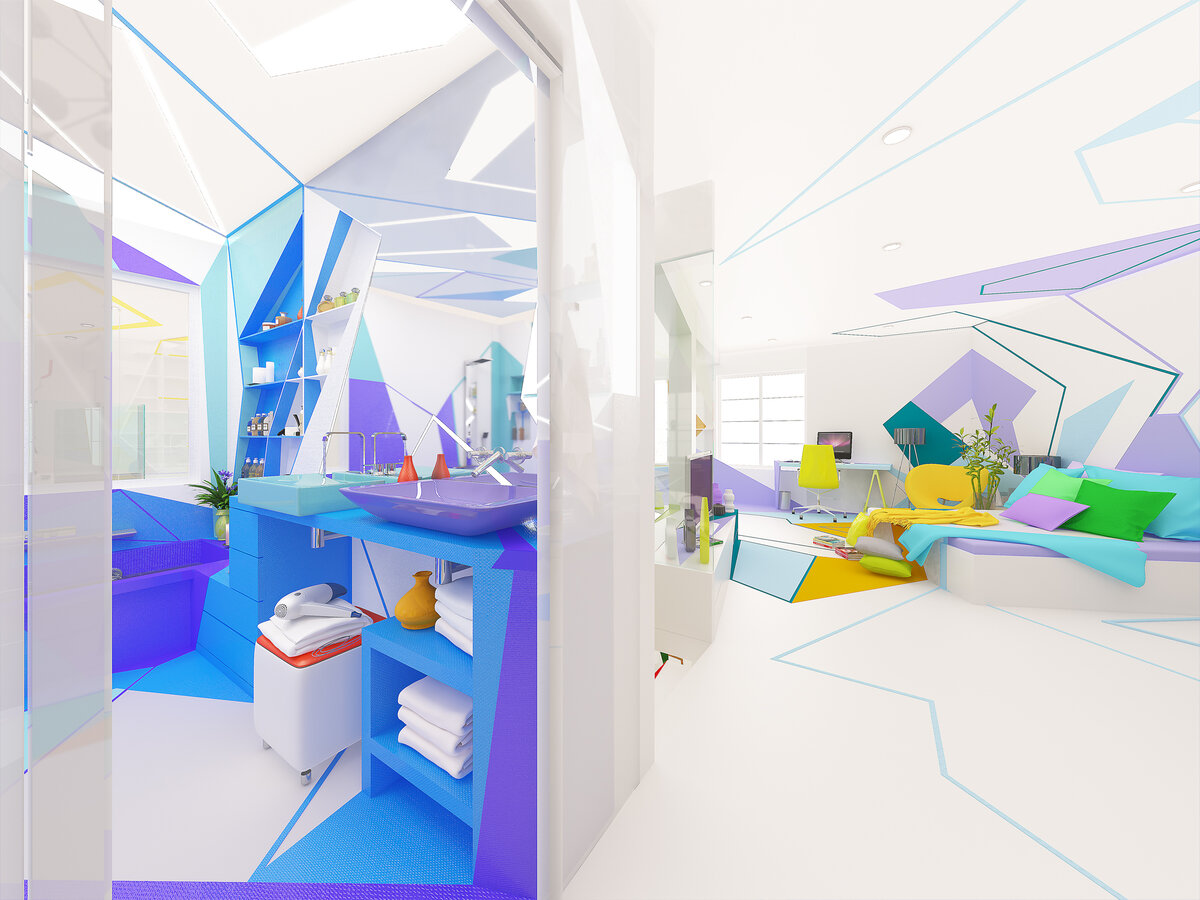
The room of the magazine cover. Lilac and turquoise give calm and softness; the yellow of the chair and throw, and the lime of the pillows, keep it playful. The lines of the ceiling descend the walls and cross the floor, so the whole room reads as one composition.
The shower cabin by the bed
pitches a tent.
The bathtub — rest.The Home Missed Itself, Book 4
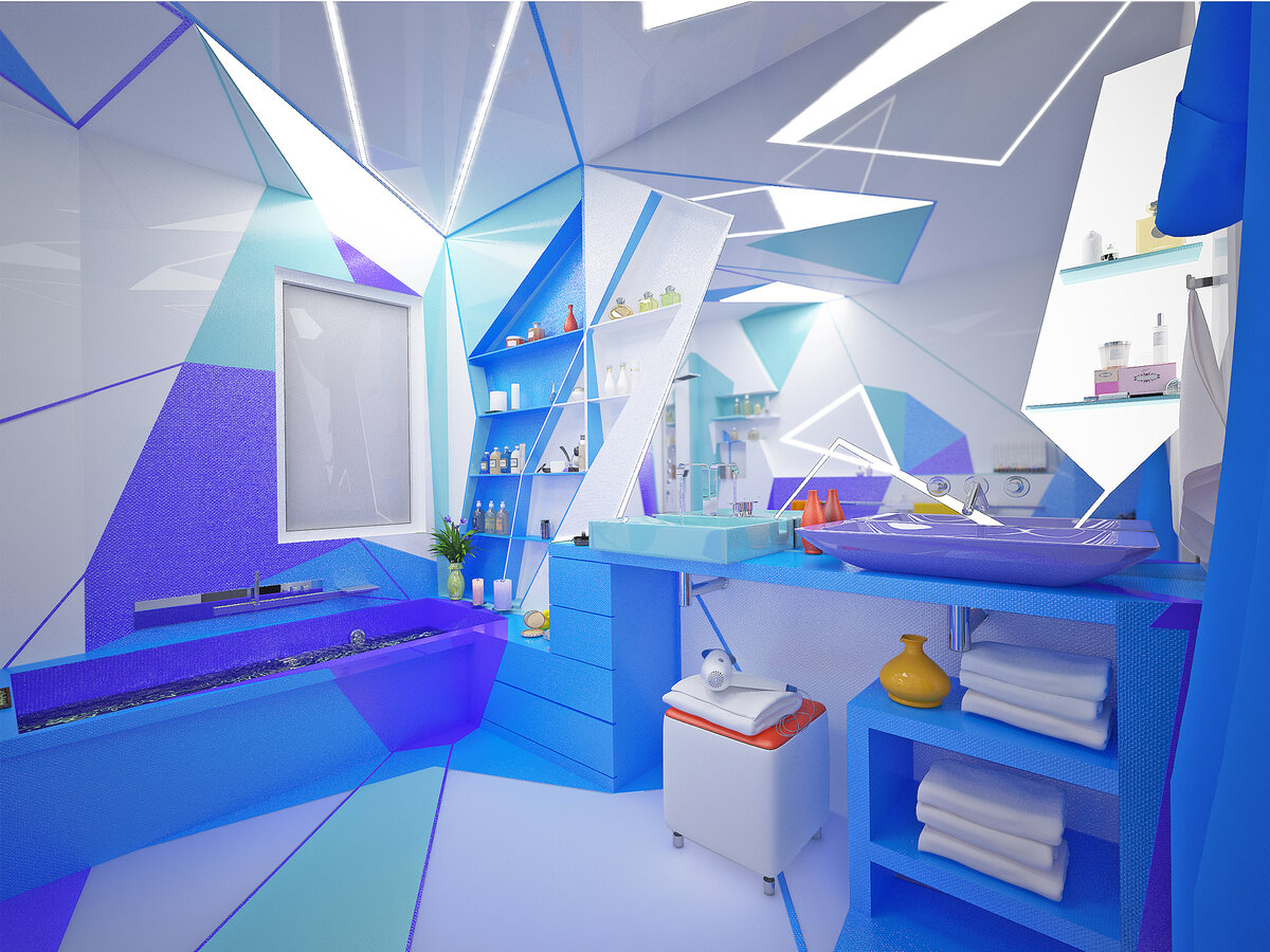
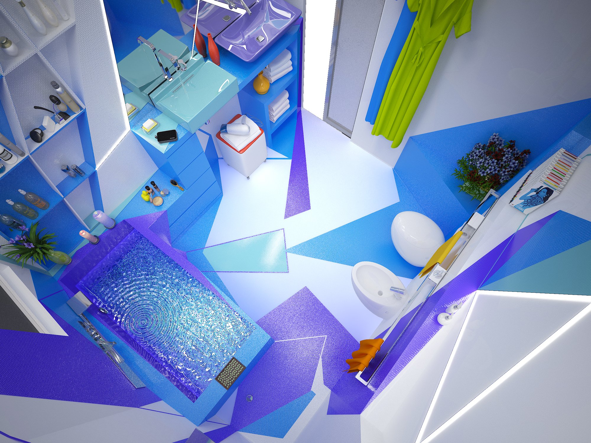
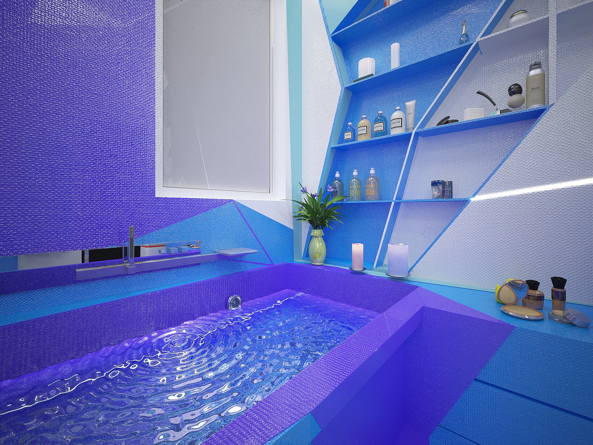
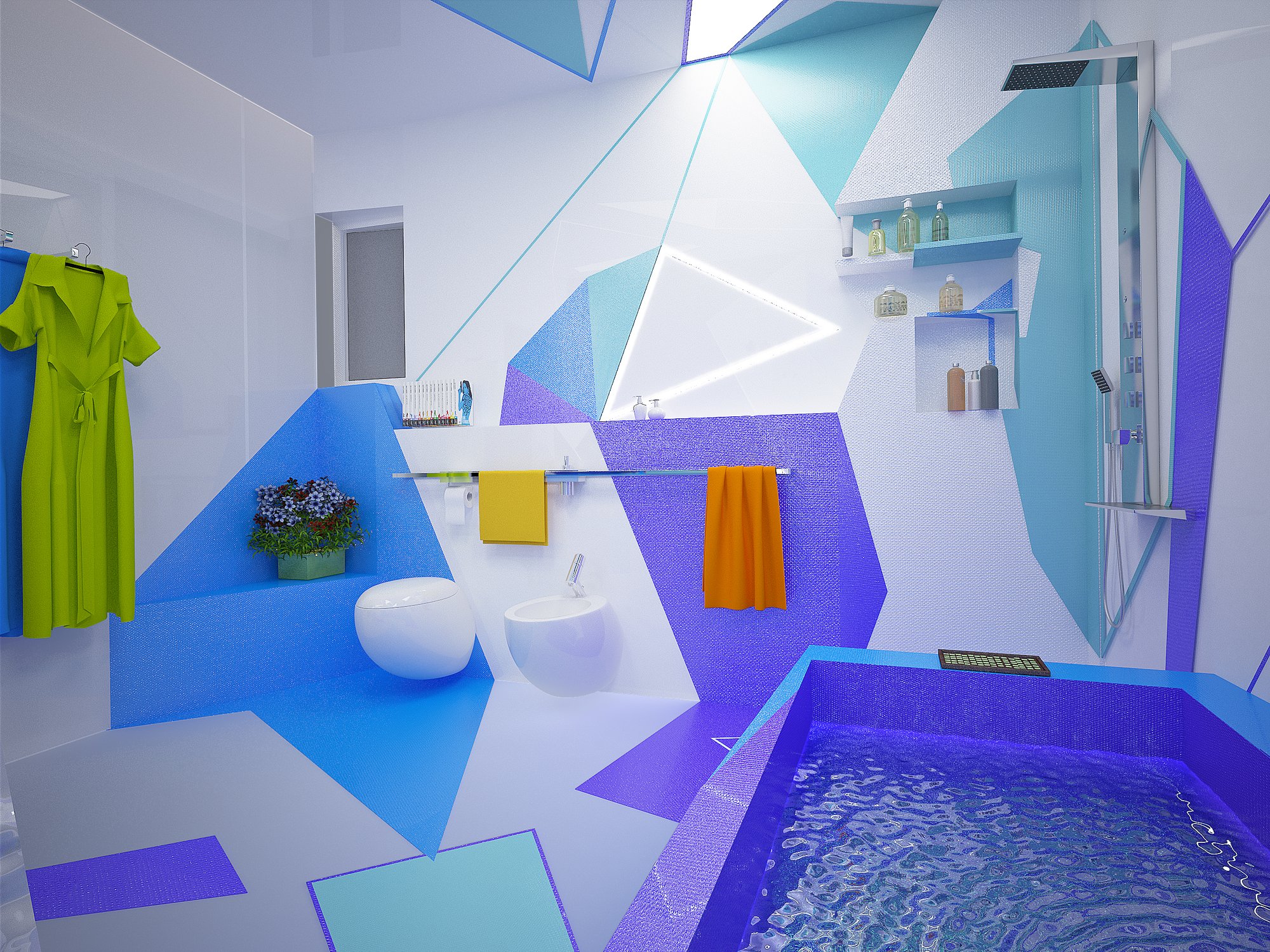
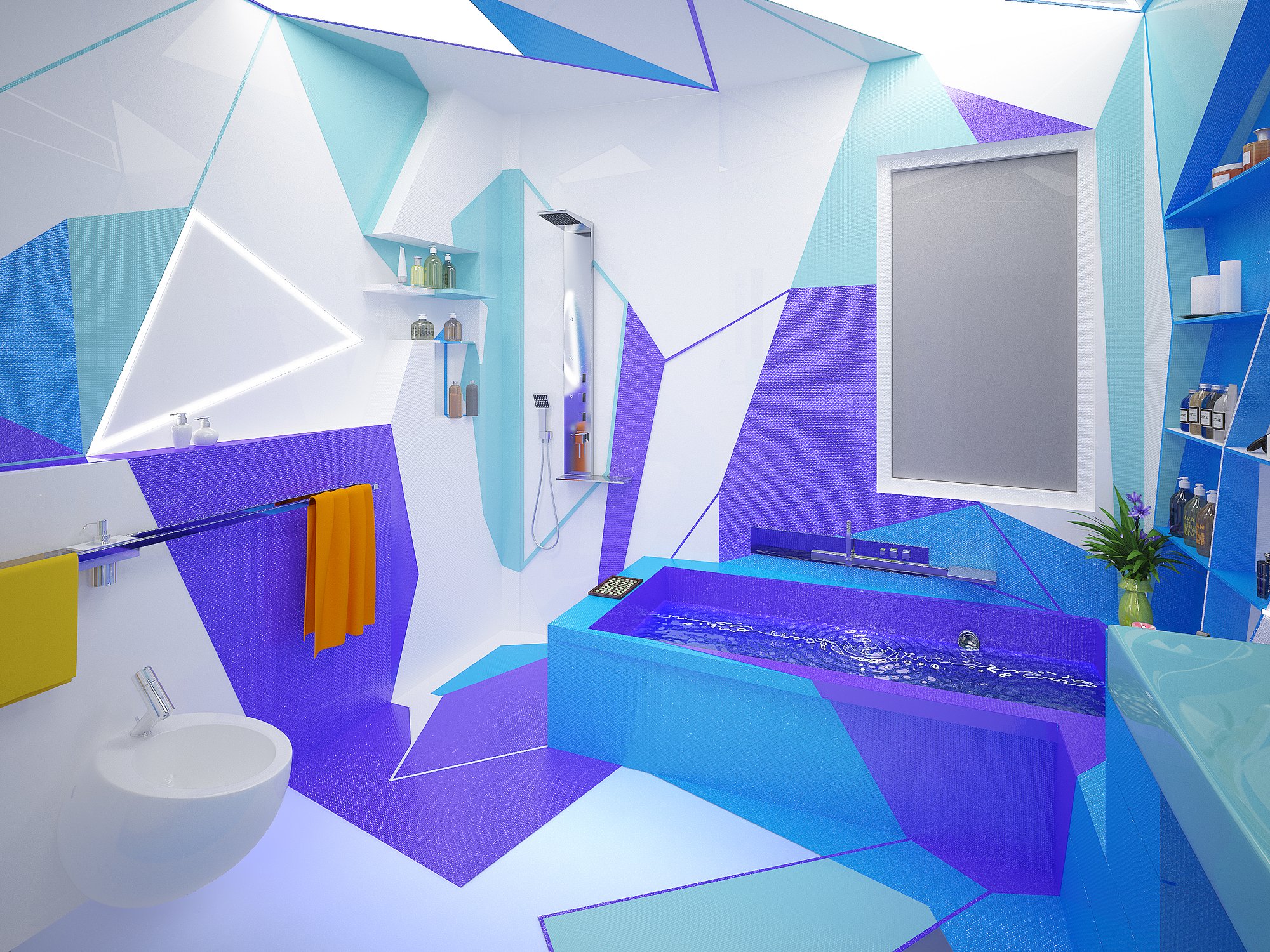
Electric blue, violet and turquoise make the room cool, fresh and clean, like water. Acute white shapes and the lit edges of the ceiling bring light into the cold colors, and small accents, a yellow vase, touches of orange, give them contrast. A glass partition opens the bathroom to the bedroom, and the two rooms share one geometry.
The Home shone.
All the colors spoke,
the white wall was their silence.The Home Missed Itself, Book 2
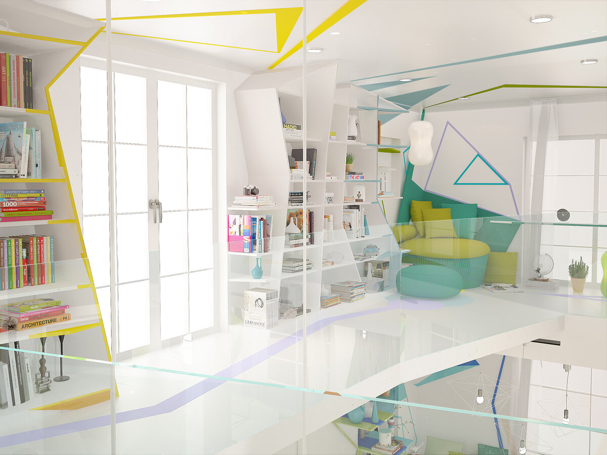
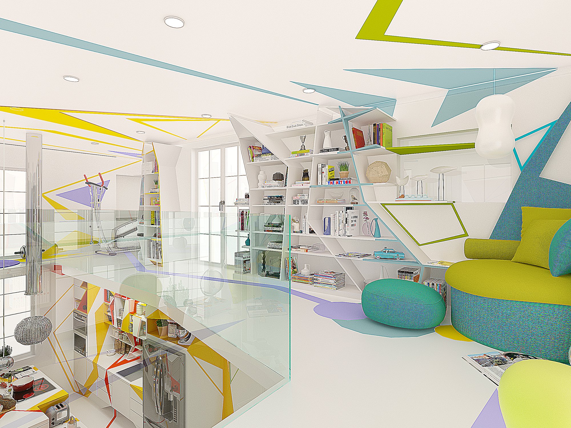
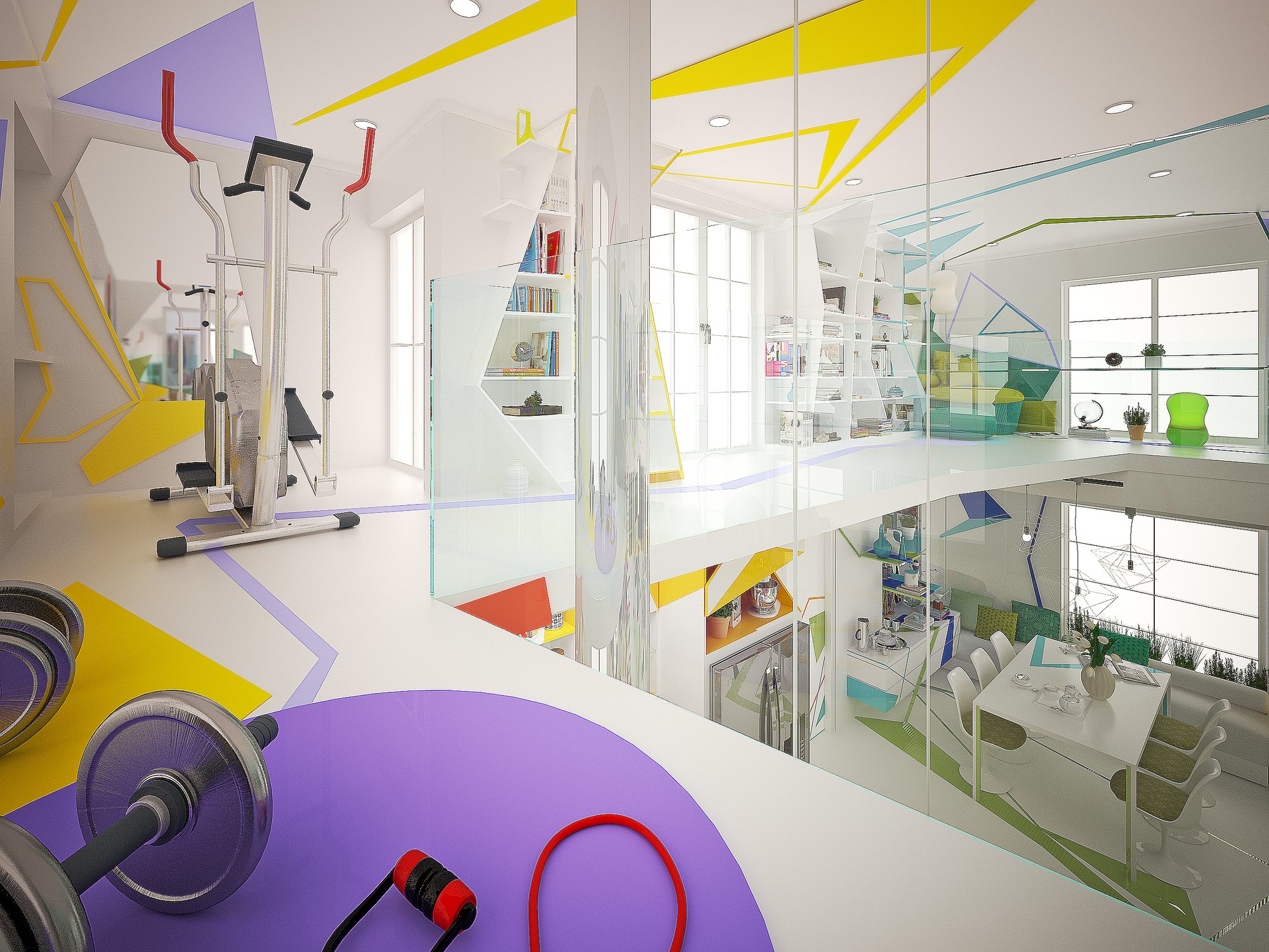
An upper level, open to the rooms below. White shelving in acute forms holds the books; the glass balustrade keeps the space transparent. Green and lilac continue from the living room, while yellow and turquoise lines on the ceiling draw the eye upward.
Innere Notwendigkeit
Inner necessity. Every form here has a reason that is felt before it can be said.
And what does your room sound like?
March 2015. The first copies of Interior Design reached Sofia in a box, with the house on the cover.
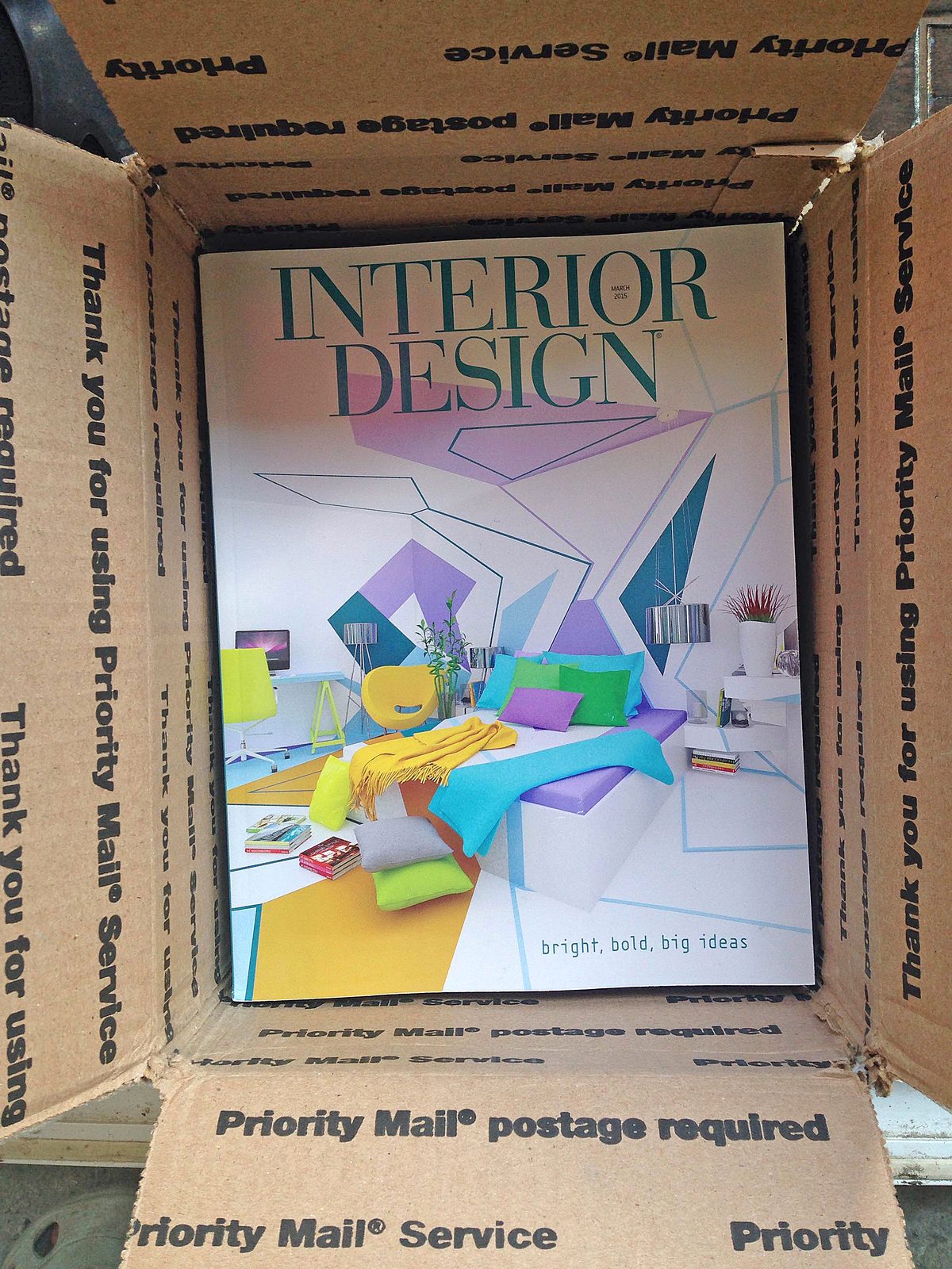
One Priority Mail box. Inside, our bedroom, printed.
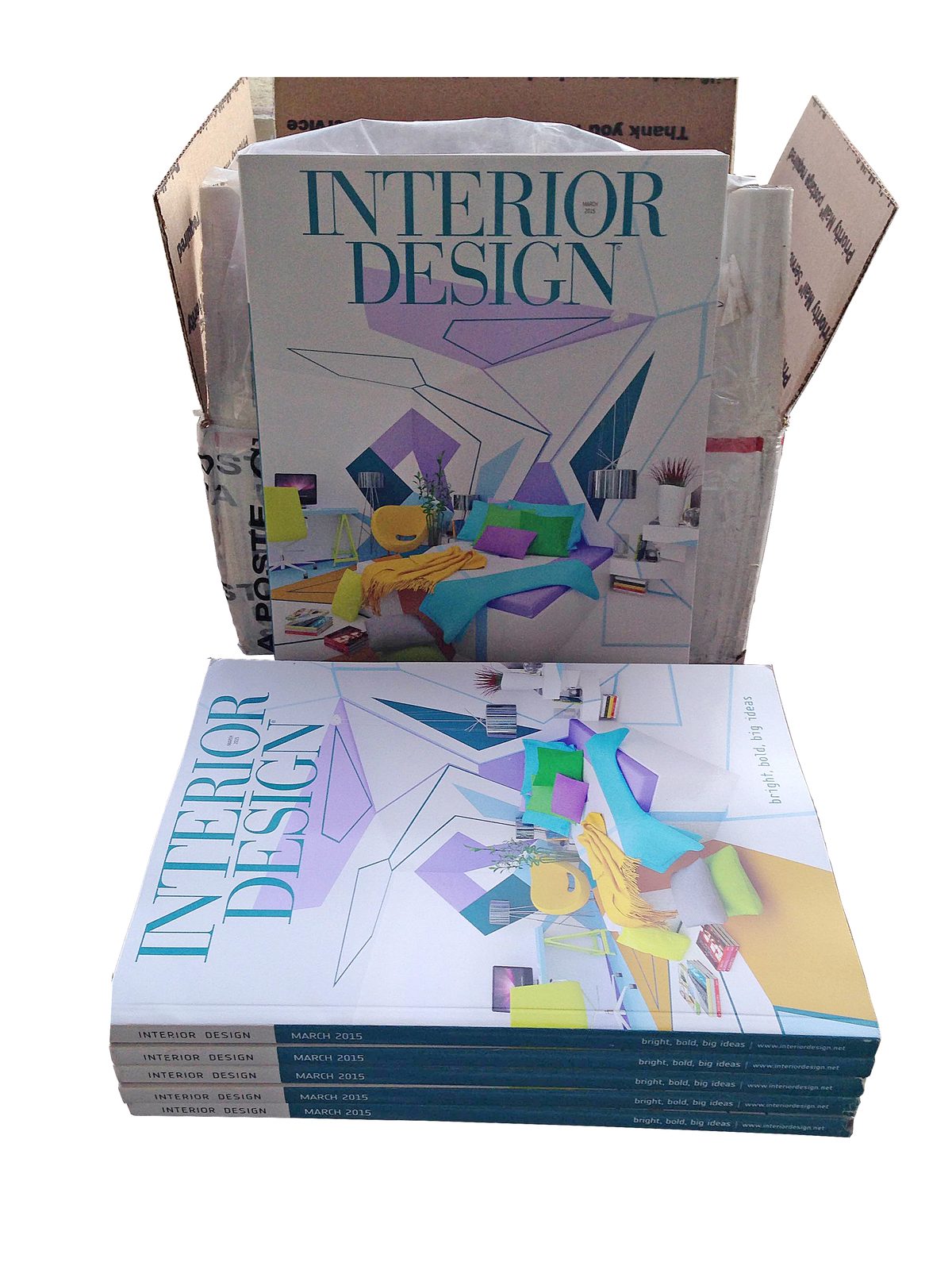
Not one copy but a whole pile, every one of them the same room.

Then down a Sofia street, the house in our arms.
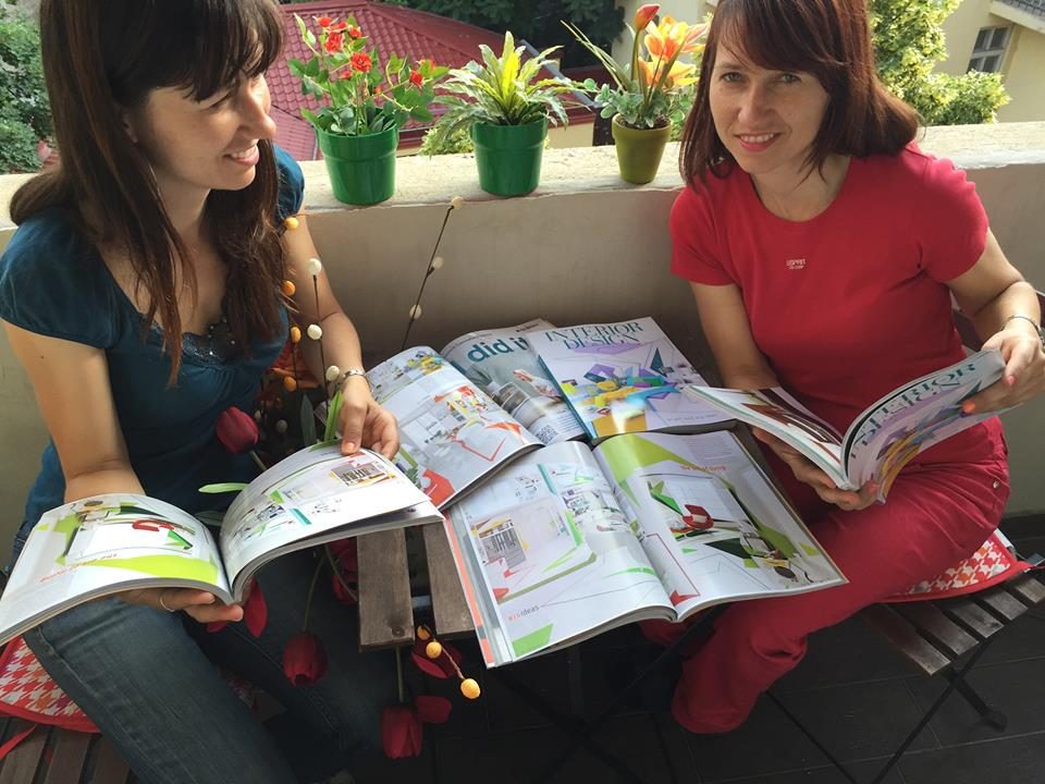
And at last, the pages open, the colors on paper.
Continue exploring
More works →